What is a mobile responsive website?
A mobile responsive website simply means that the website can be easily navigated on a mobile phone, tablet, and desktop. Responsive websites have the ability to adjust their size, layout, and proportions to be readable across devices.
Mobile Responsive: HOW it Affects Your Website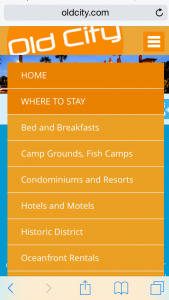
The first time we mentioned the importance of a mobile responsive website was nearly one decade ago. Oh, how time flies! All these years later, this topic is more important than ever.
Unresponsive websites are at risk of losing half of their traffic.
From May of 2019 to May of 2020, roughly 50% of web users were browsing on mobile devices. With this information, we can assume that nearly 50% of the users on our clients’ websites are on a mobile device. So, if your website isn’t responsive, you are at risk of losing half of your website traffic!
Find out how many users are on a mobile device on your website via Google Analytics.
Picture this: You are on vacation and headed out for a day of fishing. But first you need to pick up bait, so you do a Google search for ‘nearby bait shops’.
Among your search results is a locally owned bait shop. Since you would prefer to spend your money locally, you click the link to their website. Next, you head to their Products Page to find out if they carry – wait a minute. You can’t find their Products Page. In fact, you can’t find anything on the website without scrolling left to right and up and down because it is not a mobile responsive website. Frustrated that you can’t find answers, you’ll scroll to the next bait shop.
Need more convincing that you need a mobile responsive website? Keep scrolling!

The Benefits of A Mobile Responsive Website
Here are a few of the perks of a mobile responsive website:
- Users on a mobile device or tablet can easily find the Navigation (this is at the top of the website where the Home Page, Contact Us Page, and other pages are located). A mobile responsive website also allows them to easily find other information and view images better.
- Search engines (like Google) reward mobile-responsive websites with a higher SEO (search engine optimization) score. You can learn more about how SEO and mobile responsive websites correlate here.
- The Exit Rate (the percentage of times people leave your website too quickly) is lower. If your Exit Rate is high it’s likely because users aren’t having a good experience on it; not having a responsive website hugely contributes to a bad user experience on a site.

The Downfall of Unresponsive Websites
Since more people use mobile devices to browse the internet, mobile responsive design was created to provide a better user experience. Your website serves as an online marketing tool and a bad user experience is detrimental to how effective it is. Think of it like this: browsing an unresponsive site is similar to trying to find an item in a store with no aisles, no signs, and no employees.
- There is inadequate space to click on links, so the user has trouble getting information. Have you ever tried to click on a button on your phone but kept missing it? This is what the entire experience feels like on an unresponsive website.
- Users are constantly having to zoom out to find information and then zoom in to read it. Talk about inconvenient!
- Instead of scrolling up and down, users have to scroll up, down, left, and right.
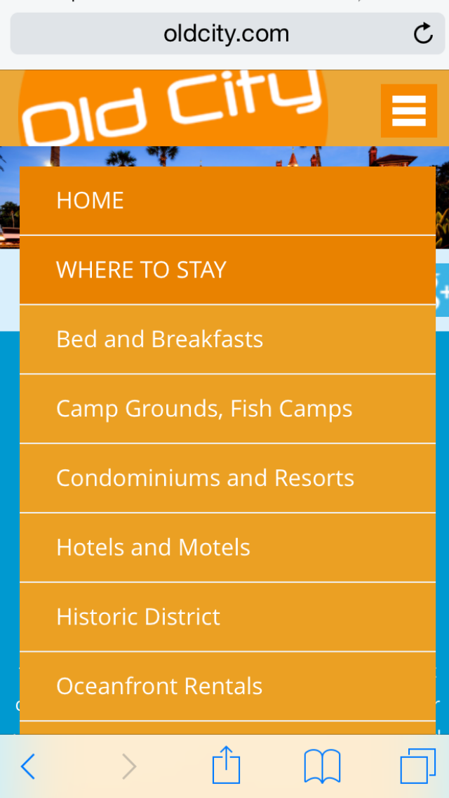
For a good example of a mobile responsive website, check out this blog on a mobile phone. Not only is OldCityWebServices.com a responsive site, but the layout of this blog was also intentionally designed to be user-friendly on a mobile phone.
Don’t put this off for another decade!
We understand that life gets busy, but this can’t wait! If your website isn’t mobile responsive, we guarantee that a mobile responsive design will astronomically improve the efficiency of your website. Remember, your website’s purpose is to be a marketing tool that works for you!
Call us at 904-829-2772 or click the button below to fill out our form.
Mission Statement
The mission at Old City Web Services is to navigate the world of web design, web development, and advertising for our clients so that they can focus on what they do best – running their business! Our business intentions go beyond the metrics of graphics, coding, and SEO. Located on Florida’s First Coast, we run a personable home front service and consider our relationship with our clients as a partnership in their success.
Please share and re-post this blog. Disclaimer: Every effort is made to ensure the accuracy of the information on Old City Web Services Blog.