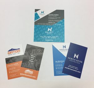
Business cards - every professional has one, but how many of them actually make an impression? Having business cards is common sense as a professional, but if you're not putting thought into them, you're missing the point.
Instead of thinking about a business card as just another thing you have to do in business, think of it this way: Your business card is a visual representation of your company and an extension of your brand.
 So, answer this question: When you hand someone your card, what reaction will they have?
If your card is like all the other ones they've received, it's likely to end up in the trash instead of in their wallet.
A business card isn't just a means of giving someone your contact information. If they keep it, they'll likely see it again in the future which will keep you on their mind.
So, how do you stand out and utilize your business card as an extension of your company's marketing?
Here are our top tips for an eye-catching business card:
Think outside of the rectangle
The standard business card is a horizontal rectangle. It makes sense. It fits easily into a wallet. But it's become so commonplace, that it can easily get lost among others. An easy fix for this is to play around with different shapes and sizes of cards. A small change in shape can make a big difference. Recently gaining popularity is the square business card - some of which have rounded edges. If you think about it, it's not really that much of a change. But the shape will catch someone's attention. What if you made a card half the usual size? While you might not be able to fit as much information as a typical card, you'll probably make a bigger impact.
It's all in the details
Cardstock is one of the most common types of materials used to make business cards. While there's nothing wrong with using cardstock, people are used to it. It's the norm. This gives you another opportunity to stand out. During the design process, think about texture and thickness of the card. Giving someone a card that feels different and has more weight to it will help increase the chance that they will actually examine the card. This way, you're playing into two of a person's senses instead of one. Even a change as simple as making your card vertical as opposed to horizontal will cause you to stand out.
Have fun with it
If there ever were a time to take risks, it would be with your business card. Creative risks can pay off big time, especially if those you hand your cards to receive stacks of them per week. If you give them something they haven't seen before, you're going to stand out in the best way.
Ultimately, your card should represent who you are. Your business is unique, and your card should be as well. Design should be a fun process. If you're a photographer, use one side of your card to showcase your photography. If you own a painting company, make one side look like a paint swatch. If you are a writer, you could make your card look like a typewriter. The options are endless.
The perks of hiring a designer to craft your card:
- You get a unique design.
- They can take your ideas and turn them into reality.
- You will end up with a quality product you'll be proud to hand out.
Here at Old City Web Services, we focus on creating unique designs that reflect who you are and make an impact. Contact us to schedule a free consultation and let us help you come up with a timeless design today.


