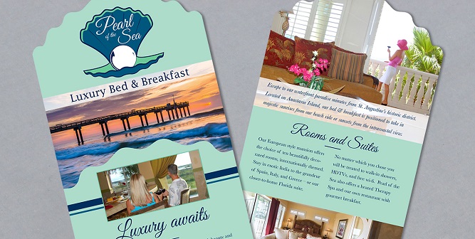
Our rack card designed for Animal Emergency Hospital of St. JohnsRack cards have been around for years and have become a staple of hotel lobbies, visitors centers, and, generally, anywhere there is a lot of foot traffic. Remember your last vacation to a new place? Sure, you may have planned out some spots you wanted to visit ahead of time, but as you checked in the hotel, it was probably hard not to stop at the display of brightly colored cards sporting attractions, restaurants, shops, and everything in between.
Here's the question: How did you decide which cards to pick up and which ones to ignore?
As a business, competition is everywhere. But in the case of rack cards, your competition is literally inches away. It's easy to get lost and looked over if you make a misstep in the design process.
So, how do you make your card stand out and get picked up?
We're here to help.
Just like with any other way of advertising your business, rack cards can be a useful marketing tool if done right and taken seriously. People make their choices in seconds of what they like and don't like - that's how long you have to make an impact.
Here are our top qualities for an eye-catching rack card:
Make a good first impression
Most of the time in a rack card display, very little of the card is actually visible upon first glance. That's great to keep in mind when you are in the design process. If you only have about a 2 in. by 4 in. space to get someone's attention, how are you going to do it? A good rule of thumb is to instantly let someone know who you are. Typically, putting your logo at the top is a good choice. Sometimes, business owners put pictures at the top, but it can get confusing. Let's say you own a kayaking company and put pictures of people kayaking. Sure, customers instantly recognize kayaks, but that still doesn't tell who you are.
Use strong pictures
People are visual creatures. Striking photos have a better chance of getting their attention in a matter of seconds than words. So, think about that when designing your card. Your main image needs to feel strong and make an impact while also conveying what your business is all about. It doesn't matter how beautiful your picture is if it is irrelevant to your business. Pictures are worth a thousand words, and if you get it right, that means less words you have to use to get your point across. For example, if you own a restaurant known for its amazing dishes, it would make more sense to showcase your best food than to show the dining room for your main image.
Display your company name prominently
If you're going to make the effort of designing, printing, and distributing a rack card, it's important to make sure people know who you are immediately. Don't make them search for your logo or company name. While this may seem like common sense, it can also be a common mistake. It's easy to get caught up in the pictures, text, and bright colors and forget that your name isn't front and center. Don't bury it in the text or at the bottom of the card. If people see pictures and paragraphs but no company name, it can lead to confusion and too much work for a customer.
Keep it clear and concise
When it comes to rack cards, less is more. Just as your picture and logo need to quickly relay who you are, so do the words you choose to use. Flooding people with text will turn them off quickly from reading your card. Give them the main things they need to know about you. And remember, you have two sides to the card, so don't feel like you have to fit everything on one side.
Important things to include:
- Short phrase supporting your mission
- Phone number
- Website
- Address
- Photos that express who you are
- Something you want to feature as one of the top assets of your business
- Coupons can also be a great addition to attract new customers
Make sure it is up to date
If you've updated your brand or website, it is important to make sure all of your marketing materials are current as well. This prevents confusion, keeps things uniform, and gives you a chance to highlight new fun things about your business!
Other uses for rack cards
- Hand them out if you are at a convention promoting your business
- Use them to hand out if you sponsor events
- Give them to new clients when they visit you for the first time
Before you print
- Make sure you know how you will be using your cards. This will give you a good idea of the quantity you will want. Also, be sure if you plan on putting your cards in other businesses or visitors centers that you go through the proper protocols beforehand. Each place of business has a different set of rules for allowing people to display their cards.
Rack cards don't have to be complicated. Let us help you! At Old City Web Services, we concentrate on putting together stunning designs that convey who you are. We work with you throughout the design process to stay true to your mission and vision. Visit our Work page to see other rack cards we've designed for our clients. Contact us for a free consultation to get started!


